
The problem
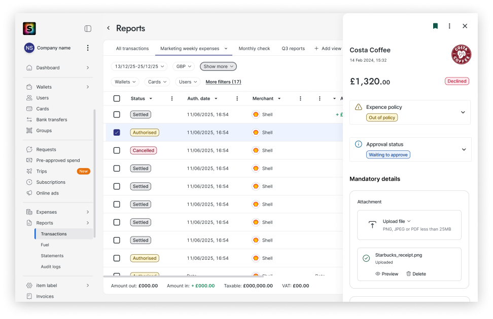
Admins chased employees for missing details. The same transaction looked different from table to table, and every role saw one panel.
My main decision
Agree shared rules for table data, then give the detail panel one layout for filling in and one for reviewing.
Evidence
Reported after release: 33% fewer reminder emails sent by admins.
One table, many meanings
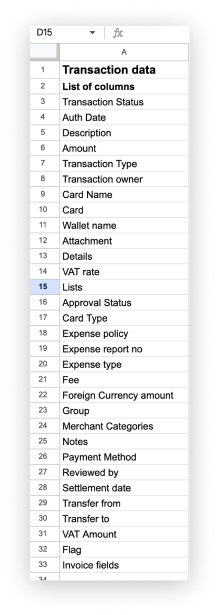
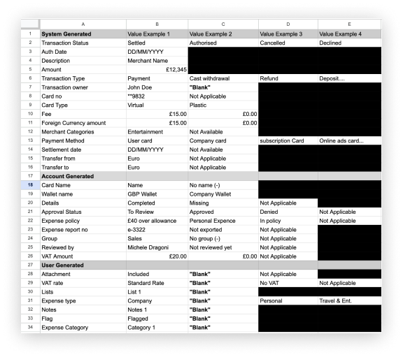
Data tables are among the most used components in Soldo, and squads had added to them feature by feature. The main transaction table alone had 33 columns, and over 60 more held other data. That is the scope I audited.
What I found
- The same default state showed as an empty cell in one table and as a value in another.
- Table headers used different controls, in a different order, from page to page.
- Similar features used different wording for the same thing.
The rules I wrote
- Every column is mapped by what the system does with it and what users need from it, with set rules for value types, default states and what a cell shows when there is nothing to show.
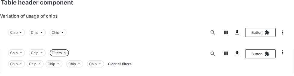
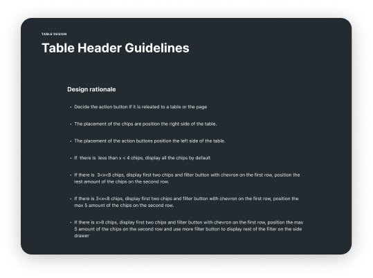
- Header chips run left to right: calendar, currency, then other filters.
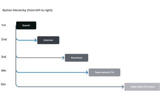
- Header buttons run left to right: search, columns, download, then the table’s own actions.
Getting squads to use the same rules
No single team owned the table, so the rules only worked if other designers used them in their own squads. I took the mapping and rationale to designers across squads to agree the principles, and worked with the Design Systems team so the rules became part of the shared component for web and mobile.
A panel for filling in, and one for reviewing
The tools to complete a transaction already existed: fields could be mandatory and a reminder function existed. But every role saw one default layout, mandatory fields weren’t surfaced, and the reminder sat under an unrelated section.
Consistent table data helps people read a transaction. A panel shaped by role helps them act on it.
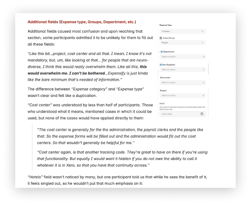
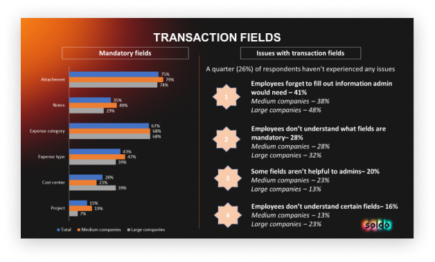
What the research showed

Research methods
- Surveys
- Customer interviews
- Usability testing
- Prototype testing
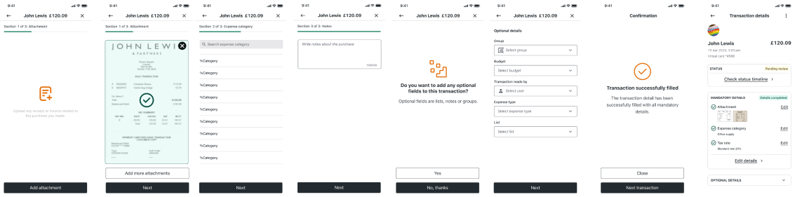
Employee / Spender: needs a quick, mobile-first way to fill out transaction details with minimal friction.
Reviewer / Manager / Accountant / Admin / Superadmin: needs to scan, review and validate transactions, often across multiple entries.
Admins: need visibility into incomplete transactions and tools to prompt users for missing info.
What I changed
- Grouped every transaction field for web and mobile.
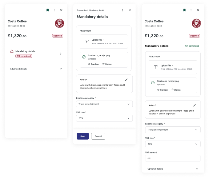
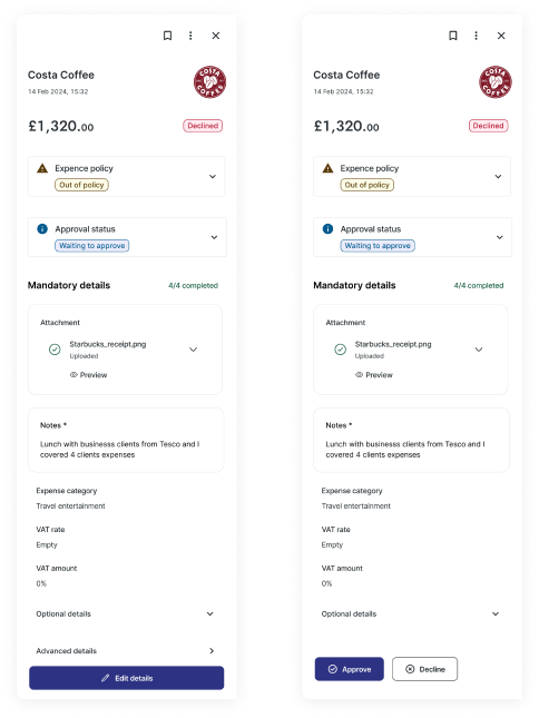
- Separated filling in a transaction (spender) from reviewing it (approver, admin).
- Let admins choose which fields each role sees and must complete.
- Moved the reminder into the transaction page, where admins need it.

Design explorations
The table rules first, then the detail panel.Mapping and categorising data
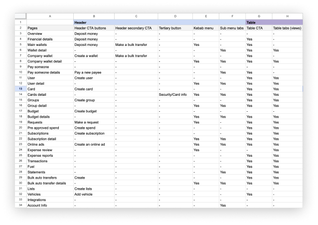


Comparing page-header and table-header actions to set the information architecture and visual hierarchy
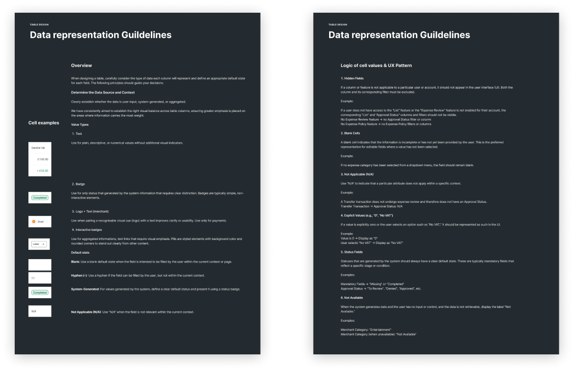

Updated column rules
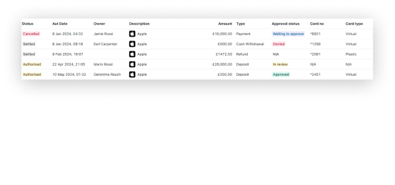
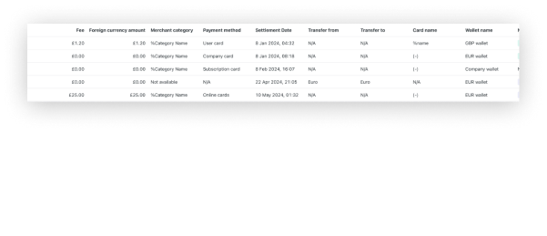
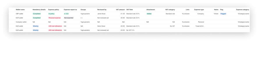

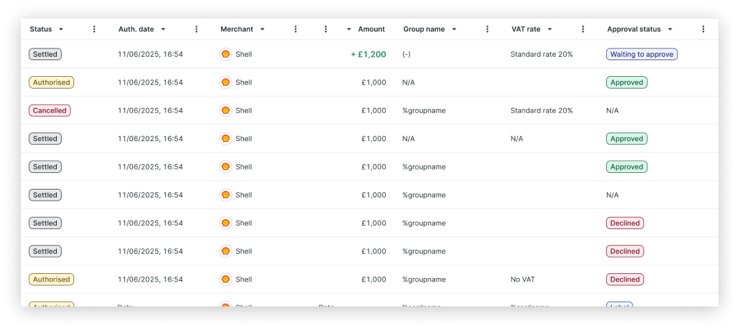

A snapshot showing 7 of the columns
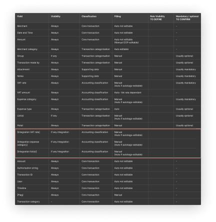

Categorising every transaction field
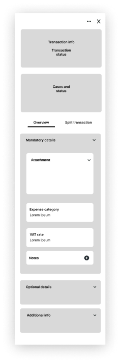

General layout and information architecture
Default view for all roles
Before (web app)
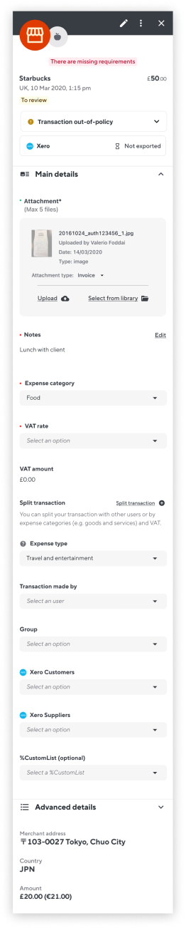
Default view for superadmin
After (web app)
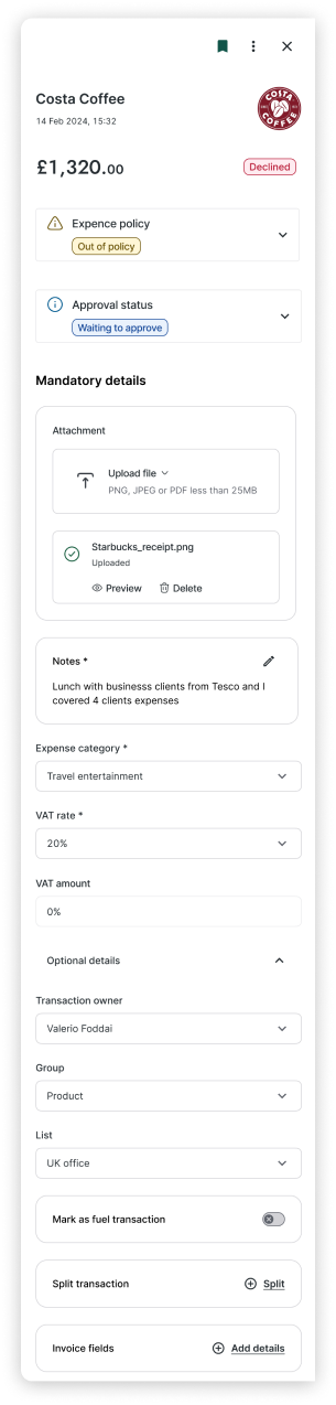
Spender view (for example, an employee)
Approver view (for example, a manager)
Spender workflow in the mobile app (previous UI kit)

After release
These figures were reported after the panel and flow changes shipped. They describe that work, not the table rules on their own.
reminder emails sent by admins. (reported)
Also reported
- 22% higher mandatory field completion, month over month
- 30% less average time to complete a transaction’s details
- 35% higher task completion on mobile
The table rules were adopted across squads and in the design system.