The problem
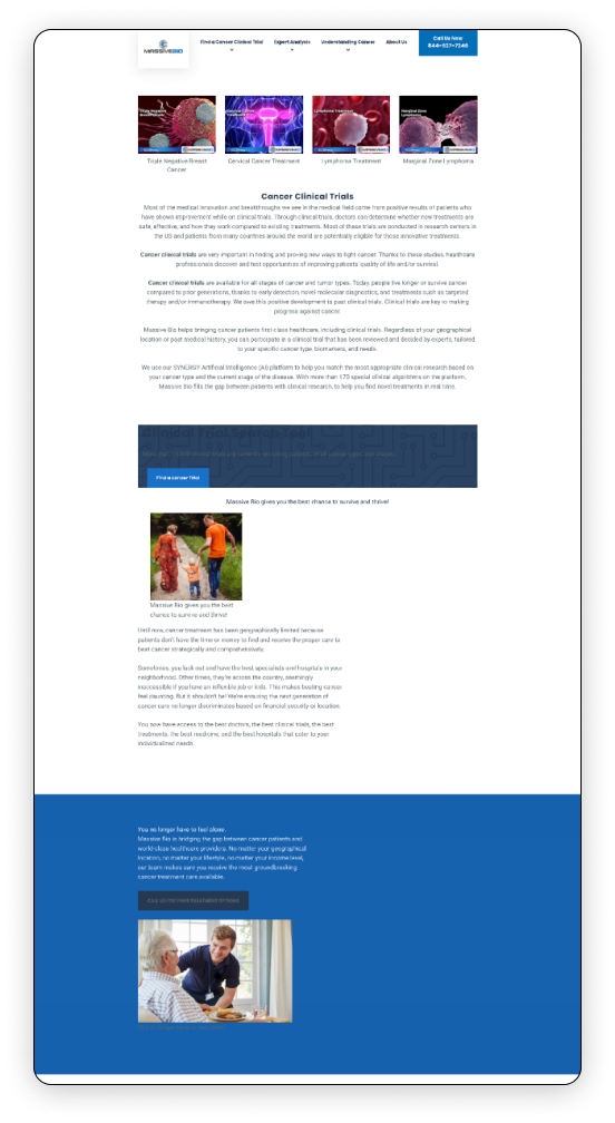
Patients reached the site without understanding what a clinical trial is, and the site didn’t explain it.
My main decision
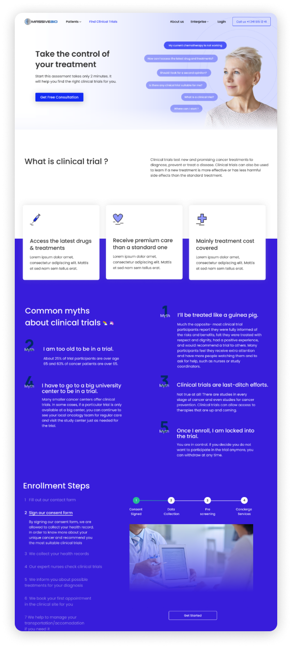
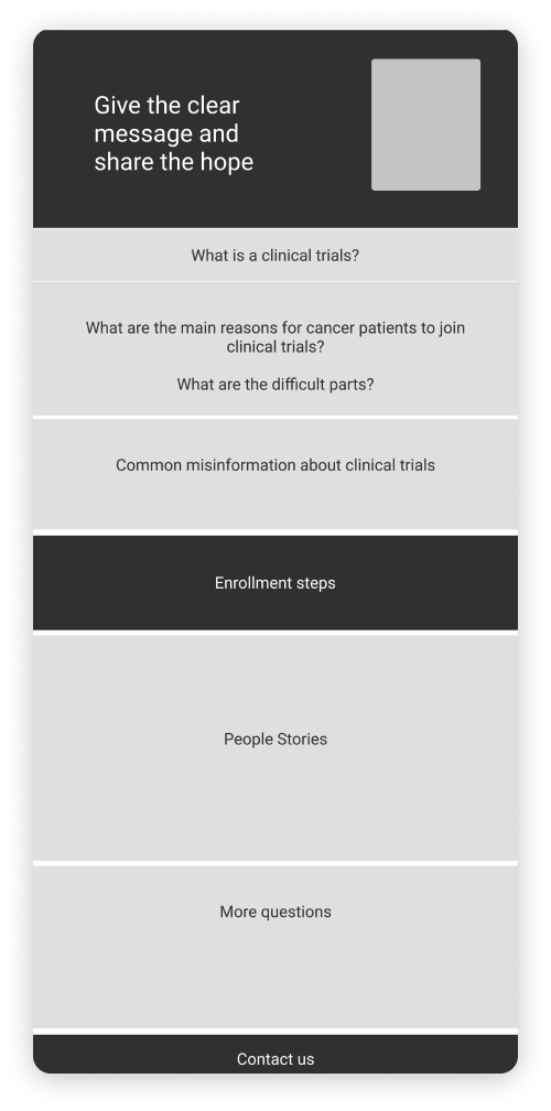
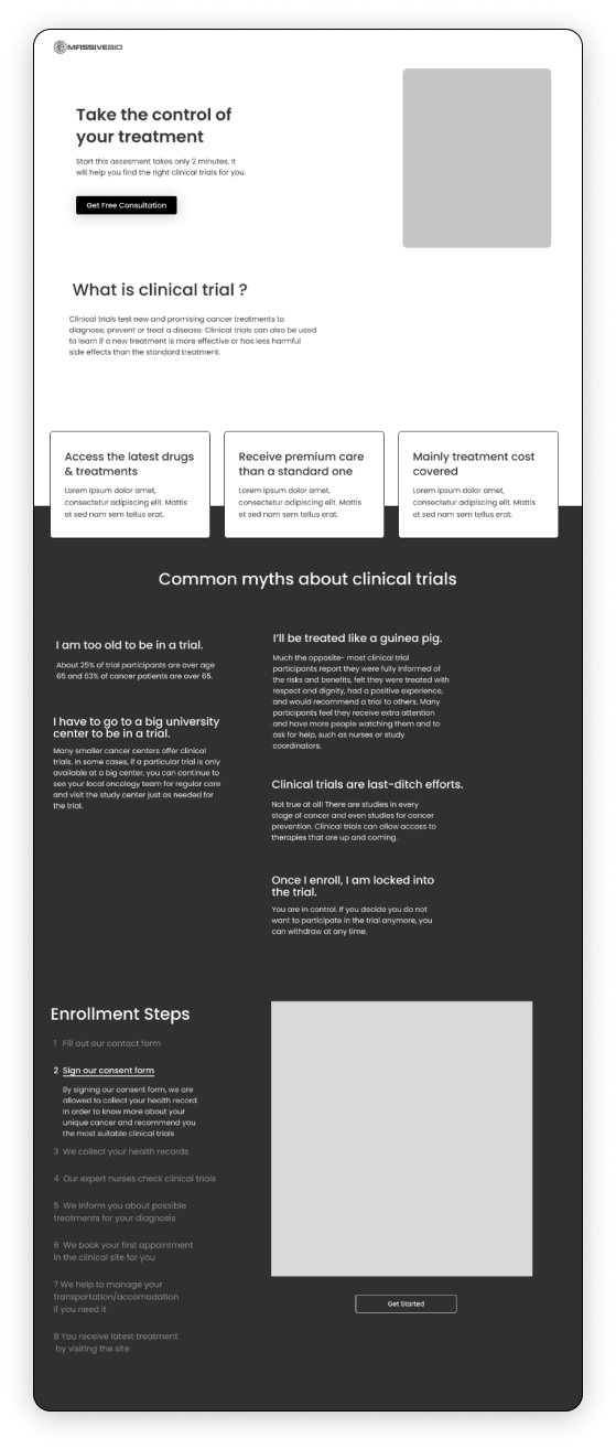
Rebuild the “What is a cancer clinical trial?” page around the questions patients ask, in the order they ask them.
Delivered
Information architecture, wireframes, a UI concept and a brand kit.
The questions patients kept asking
Massive Bio connects cancer patients with clinical trials. In interviews, the patient care team said callers kept asking two things: what is a clinical trial, and why should I consider joining one?
I learned about patients through the patient care and support teams, online communities and site analytics, not through interviews with patients themselves.
Answering them in order
- A simpler information architecture, so people reach the explanation before they get lost.
- The trial page structured around patients’ questions, from what a trial is to why it might be worth considering.
- Mobile layouts for patients and caregivers.
- A clear hierarchy, plain language and reassuring visuals, designed with accessibility in mind.
What I can and can’t show
My work ended with the deliverables: information architecture, flows, wireframes, a UI concept, a refreshed visual language and a brand kit. Accessibility was a design goal, not something I tested. I don’t have post-launch data for this project.

Design explorations
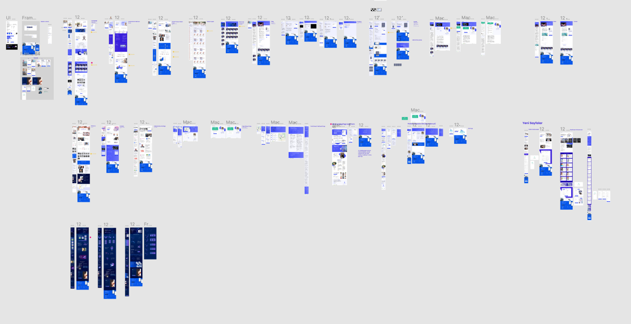
Discovery, information architecture, wireframes and the final design.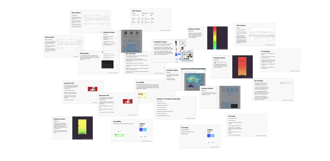

Before design

Information architecture (IA)
Wireframes
Final design