
The problem
HotelsPro worked like a consumer booking site, but agents use it to build offers for clients many times a day.
My main decision
Build offer creation into search: pick several hotels, save them, and send one offer to the client.
What changed
Agents can build, save and share a multi-hotel offer inside the platform.
An agent’s working day
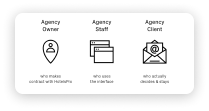
HotelsPro sells hotel rooms to travel agencies. Agents compare prices across several platforms and put together offers for their clients. The platform had been built with a consumer booking mindset, so it had no way to turn hotel results into an offer, save a search or come back to one. Agents copied data into spreadsheets and email instead.
Four workshops with the people closest to agents
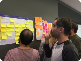
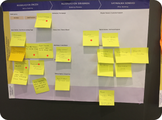
Alongside analytics and usability findings, we ran four group sessions to map the experience before, during and after booking. The sessions surfaced pain points, regional differences and needs the platform didn’t meet. Together with the analytics, they pointed to the repeated job: building a proposal for a client, not booking a single room.
Building an offer: select, assemble, save, share
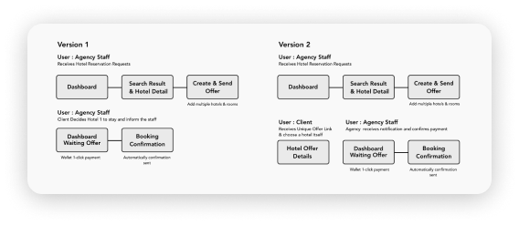
I mapped the new journey from the dashboard through search results to creating and sending an offer, then to booking confirmation. Selecting hotels happens in the search results the agent is already using, so an offer grows out of a normal search instead of a separate tool.
Search results for people who know what they want
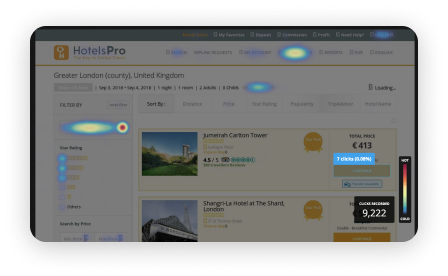
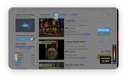
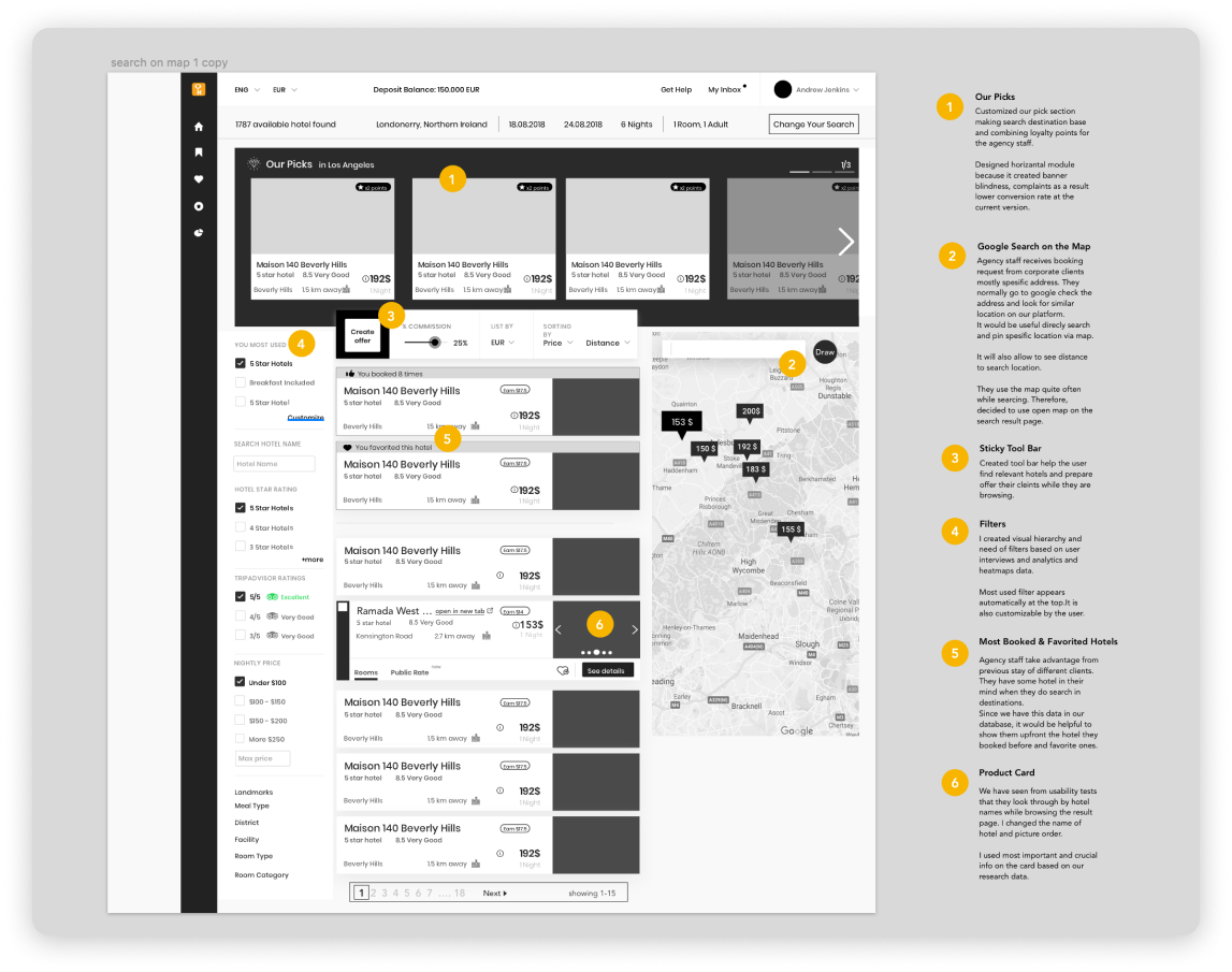
Click heatmaps showed much lower engagement on the HotelsPro search results page than on the consumer site. The “Our Picks” module was often skipped and broke up scanning, so we removed it and put the most relevant hotels first, based on the agent’s preferences and filters.

Design explorations
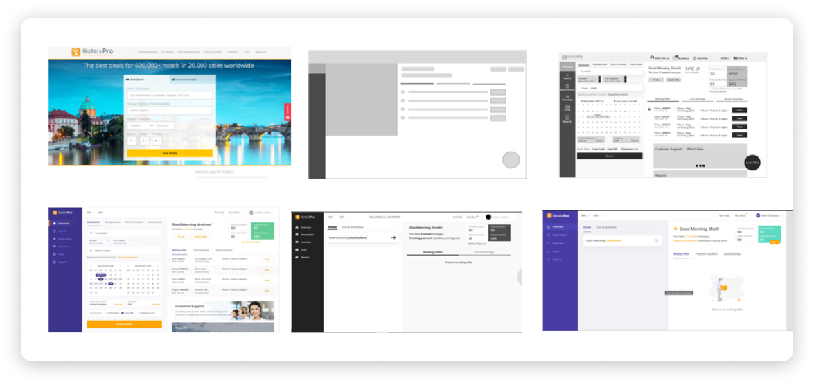
Journeys, workshops, search analysis, wireframes and the final dashboard.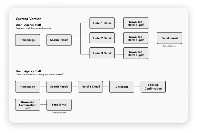

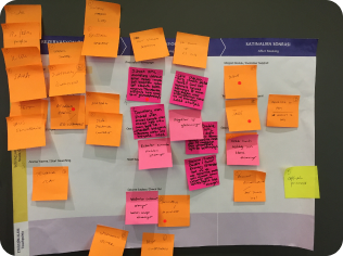
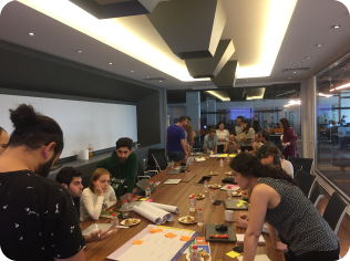
To complement our analytics and usability findings, we ran a series of workshops to capture on-the-ground insights from those closest to the users.
We facilitated 4 focused group sessions to map out the pre- and post-booking experience, uncovering pain points, regional nuances, and unmet user needs.
Search Results Engagement Analysis
We analysed user interactions on the search results page of both the B2B (HotelsPro) and B2C platforms to identify engagement gaps.
HotelsPro’s (B2B) search result page showed significantly lower engagement compared to the B2C counterpart.
One key friction point was the "Our Picks" module, which users often skipped or ignored. It disrupted the scanning flow and added unnecessary noise to a task-focused experience.
Action taken: We removed the “Our Picks” module and prioritised surfacing the most relevant hotel options based on user preferences and filters—streamlining the experience for returning, task-driven agency staff.
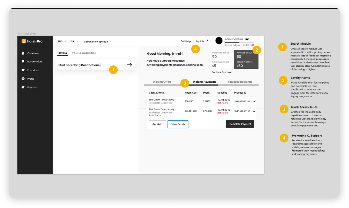
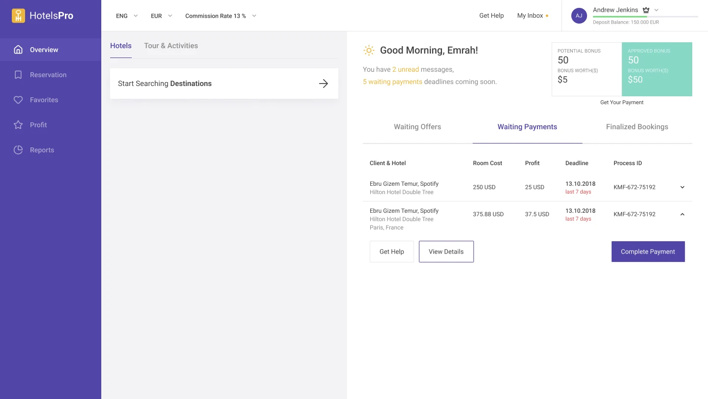
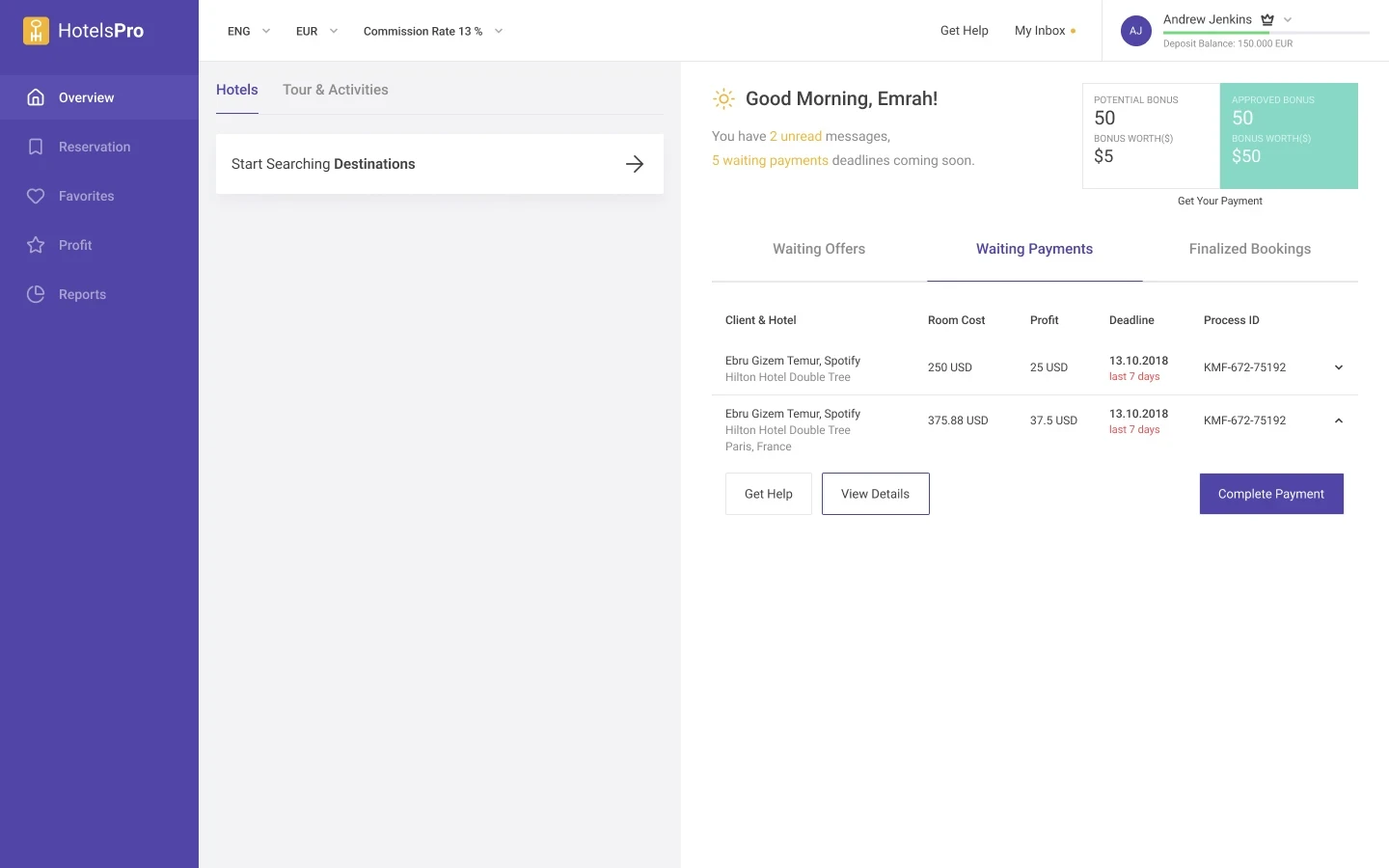
The dashboard opens on what needs the agent today: unread messages, payments due soon and offers waiting on a client. Search sits on the left, so a new offer is one step away.
What the prototype changed
A separate change came from testing. The first prototype showed the whole search module at once, and we got a lot of feedback about its complexity. I changed it to a progressive search bar that takes the agent through one step at a time.